The Foundation of Lista’s Design described the model behind Lista: a minimal structure, a few item properties, and the filters that bring the two together. This post is about how that model comes to the screen, and the strategy behind it.
Two layers
Lista is designed in two layers: navigation and content.
The navigation layer is the split view that holds the sidebar and your items, along with toolbars, sheets, and windows. Lista uses Apple’s system components for all of it, as they are. Its design here is in how it uses them: how information is organized, and where each tool sits.
The content layer is where Lista’s own design language lives. It covers what is inside the sidebar, the list of items, adding an item, and item details, all designed specifically for Lista. Even here, Lista builds on the platform’s native components, using the collection and table views Apple’s frameworks provide on iPhone, iPad, and Mac. That is what keeps the content feeling at home on each platform, with the interactions people expect from a native app, like drag and drop.
Part of the device
With Liquid Glass, the navigation layer feels less like part of each app and more like an extension of the device itself, close to the hardware it runs on. It looks the same in every app, and it works the same: split views, stacked navigation, and sheets follow the same patterns everywhere, so people already know how to use them.
Lista draws the line exactly where Apple’s own guidance does: standard components for navigation, and its own identity in the content.
Moving with the platform
That familiarity also holds over time. When Apple’s platforms change, Lista changes with them, and only as much as they do, so it stays the app people are used to.
Liquid Glass. The new design groups toolbar buttons together, where earlier versions spread them across the bar. Regrouping Lista’s toolbars to match was the only significant change. Beyond the new look every app gained, Lista stayed as people knew it.
iPhone resizability. In iOS 27, iPhone apps became fully resizable in iPhone Mirroring on the Mac. Lista already adapted to any size, so it needed no changes at all.
iPhone Duo
iPhone Duo, Apple’s first folding iPhone, is the clearest example so far. It brings a new form factor, with poses from closed to partly folded on a table, and a new layout, with toolbars on the side of the display instead of the top and bottom. Apple’s guidance is not to design a custom layout for each pose, but to let the existing layout expand to the space available. Apple also notes that apps that use standard system components and support resizing adapt to the poses with little adjustment. That is how Lista is built.
What Lista needed to change came down to two things, both to fit the new vertical toolbar. It replaced its own “more” menus with the system overflow menu, which takes in the buttons that don’t fit, and it avoided toolbar buttons that show text, which can’t go vertical.
Everything else worked as it already did:
- Opening, closing, folding, and rotating the device continuously resize and adapt the interface.
- With the device open, the inner display gets the same sidebar layout Lista uses on iPad and Mac.
- Adding an item uses a system sheet, so the system places it for every pose. Partly folded like a laptop, for example, the device puts the keyboard on the lower half and the sheet on the upper half.
- Split View puts Lista beside another app, or beside a second Lista window thanks to its multi-window support. Either way, you can drag items from one window to the other.
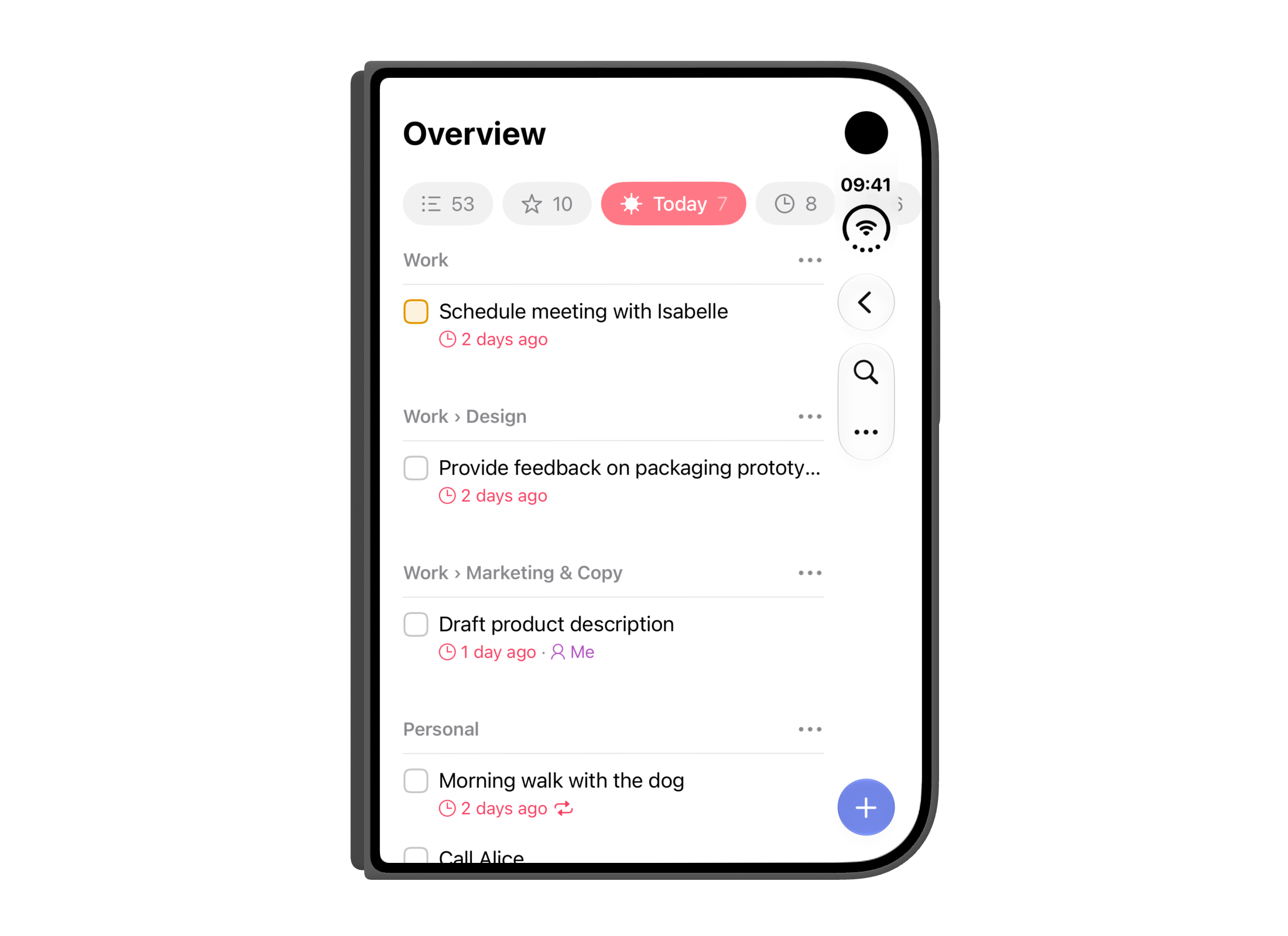
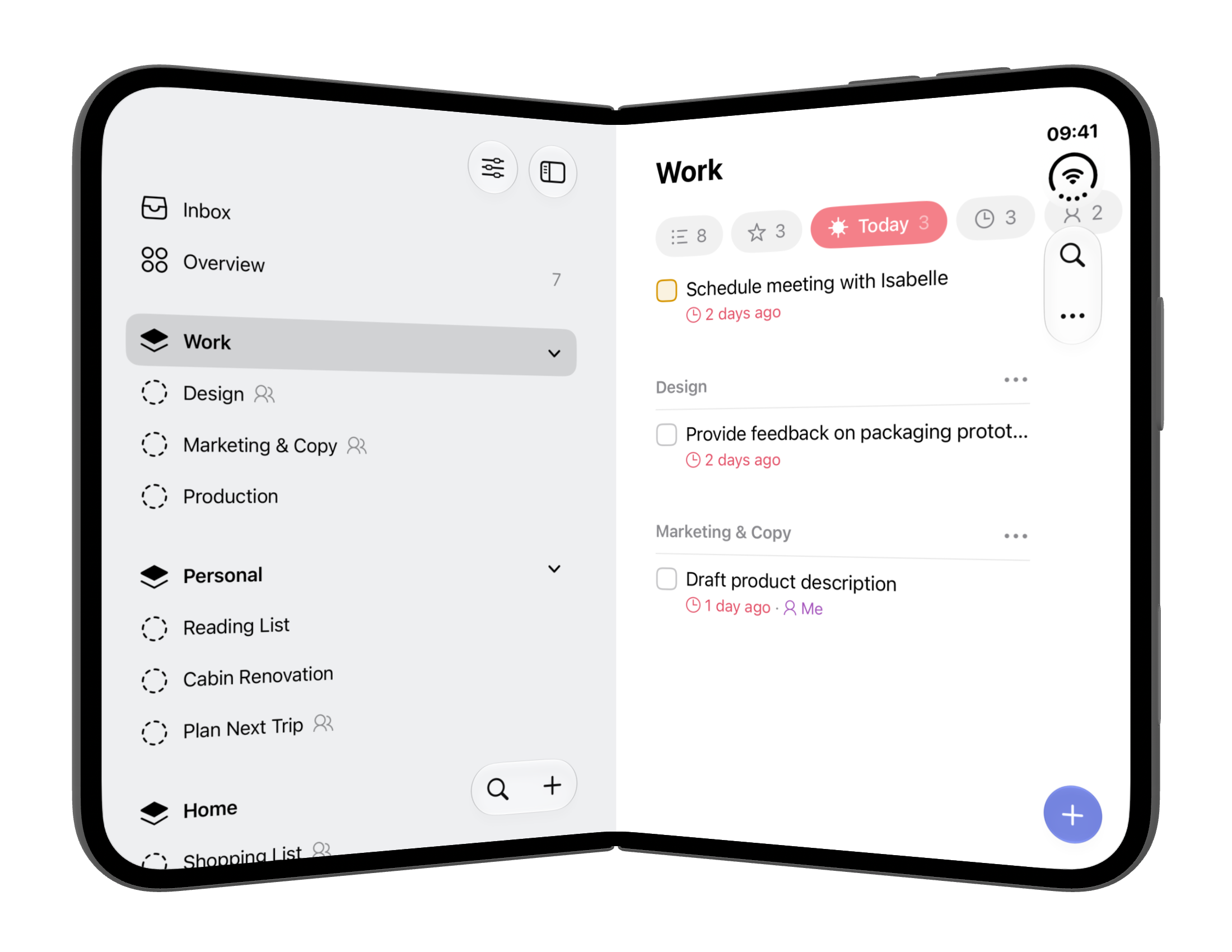
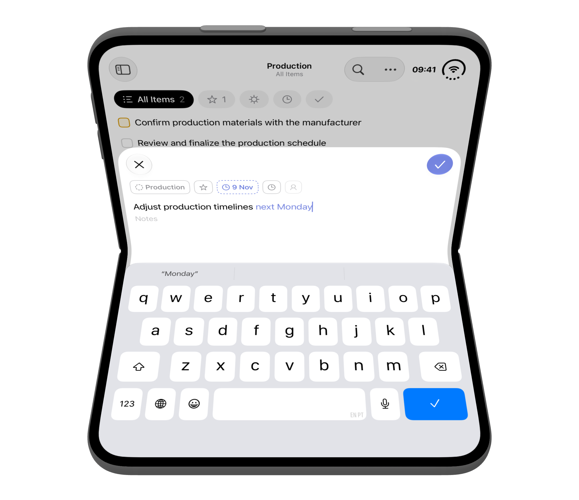
Lista supported iPhone Duo from the device’s first day, with nothing built exclusively for it. The system’s navigation components handle the poses well, and so far no use case has called for an adaptation of Lista’s own. So Lista on iPhone Duo is the same Lista you know from every other device.
The strategy
Keeping the navigation layer standard is as deliberate as any detail in Lista’s content. It is what gives Lista one consistent experience across iPhone, iPad, and Mac. And it is what lets Lista follow Apple through new designs, new devices, and new form factors without breaking with what people already know. The navigation layer evolves with the system. The content layer, built on native foundations, carries Lista’s own design language along with it.
Lista is on the App Store for iPhone, iPad, and Mac.